
The Biology Project Style Manual
Preparing Images for the WWW
The size and quality of images can make or break a web page. Large images are cumbersome and take to long to load, yet small images may be of such poor quality that they are not worth displaying at all. The key is to maximize the quality of the image while minimizing the image file size and physical dimensions.
There are 7 basic steps to preparing an image for use in a web document:
- Digitize
- Enhance (interchangeable with 3)
- Crop (interchangeable with 2)
- Reduce the size (enhance again, if needed)
- Add finishing touches (like text and arrows)
- Reduce bit-depth
- Save the image in the right format
- Digitize
- Enhance
- Crop
- Reduce the size
- Add finishing touches (like text and arrows)
- Reduce bit-depth (for GIFs only)
- Save the image in the right format
Digitizing an image is the process of converting an image from analog to digital format. Analog images are data represented in continuous form. The digitizing equipment samples the analog image at regular intervals and converts the continuous data into a series of discrete pixels. Each pixel of a digital image has an x-y coordinate and a digital value. The x-y coordinate describes where the pixel is in the image, and the digital value describes the color of the pixel.
The equipment required for digitizing depends on the media you begin with. Here are some suggestions:
Photographs can be digitized with a flatbed scanner.
Slides can be digitized with a slide scanner, or a flatbed scanner with a transparency adapter. Slide can also be sent away to be put on a Kodak PhotoCD.
Videotapes, laser discs, and a live signal from a video camera can be digitized with a video capture card (they often are included with new computers).
Scenes or objects can be digitized with a digital camera. Or, film from a 35 mm camera can be developed to Kodak PhotoCD.
A digital image is an array of numbers, with the numbers mapped to a palette of colors. When processing an image, you can change the digital values of the pixels (i.e., with Photoshop filters), or the way the palette displays those values (i.e., by adjusting brightness and contrast).
The options available for enhancing and processing images can be overwhelming. Experiment with different image enhancement techniques available in Photoshop-but make sure you have a saved copy of the original image in case your experiment fails. Following are some basic Photoshop techniques for making images look better.
Unprocessed Scan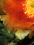
|
Brightness/Contrast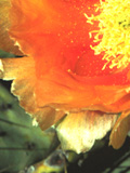
|
Photoshop has many filters and palette adjustments. Mix and match to find the best combination for the image you are working with. You can always undo the last thing you've done in Photoshop by choosing Edit/Undo. |
Sharpen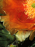
|
Hue/Saturation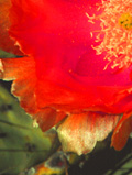
|
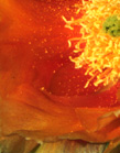
|
Once you have enhanced your image, you may find that it is not necessary to have the entire image in your document. If only one area of an image is meaningful, then you should crop out the rest of the image. This will help focus the viewer on the important features and will also reduce the image size. |
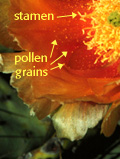
| After you have enhanced, cropped, and resized the digital image, you can add the finishing touches. Text, outlines, and arrows should be the last elements added to an image. If they are added earlier in the process, they will be corrupted by the enhancements and resizings. If you have the option, you may want to use anti-aliasing to prevent text and lines from looking jaggedy.
Creating Killer web sites has a nice demonstration of anti-aliasing. So does Creating Graphics for the Web.designer. |
|
If you're saving an image in GIF format, you'll want to reduce the number of colors in that image to keep the file size minimal. The number of colors in an image is determined by its bit-depth. Higher bit-depth means there are more colors in the image (see guide below).
|
Especially useful is Creating Killer Web Sites' section on eyeballing the palette which shows examples of the same image in different bit-depths. For a more detailed discussion of 8-bit graphics, see the YWSG section on optimizing graphics. Creating Killer Web Sites' section on color cubes has a Netscape color cube and instructions on how to use it in Photoshop. |
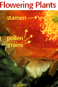
In general, photographs are better displayed in JPEG format, and computer art and line drawings are better in GIF format. GIF, however, has some nice features that JPEG does not have, namely interlacing and transparency.
|
For details on special GIF formats, visit the YWSG pages on:interlaced gifs For a summary of the advantages of GIF and JPEG images, visit the YWSG page: Summary of File Formats |
Books on web graphics
Creating Killer Web Sites by David Siegel, Amazon Books, 1996.Designing Web Graphics: How to prepare images and media for the web by Lynda Weinman, New Riders, 1996
Getting Started in a New Medium: Designing for the web
Web references on style & design
The Web Style Manual put out by Patrick Lynch at the Yale Center for Advanced Instructional Media is an well-thought out, academic approach to web design. It's been criticized for treating the web too much like a book publication.Adobe's Tips & Techniques has a collection of seminars on advanced web page design.
Design Tips is glimpse into the Killer Web Sites book by David Siegel.
The University of Arizona
Friday, August 8, 1997
denicew@u.arizona.edu
http://www.biology.arizona.edu/the_biology_project/style_manual/preparing_images/preparing_images.html
All contents copyright © 1996-7. All rights reserved.

